ASK
Develop a visual identity for the Little 500 that matches the scale and legacy of “The World’s Greatest College Weekend.”
Develop a visual identity for the Little 500 that matches the scale and legacy of “The World’s Greatest College Weekend.”
INSIGHT
Relying on the university’s cream and crimson kept the race visually tied to IU instead of allowing it to stand as its own event.
Relying on the university’s cream and crimson kept the race visually tied to IU instead of allowing it to stand as its own event.
CONCEPT
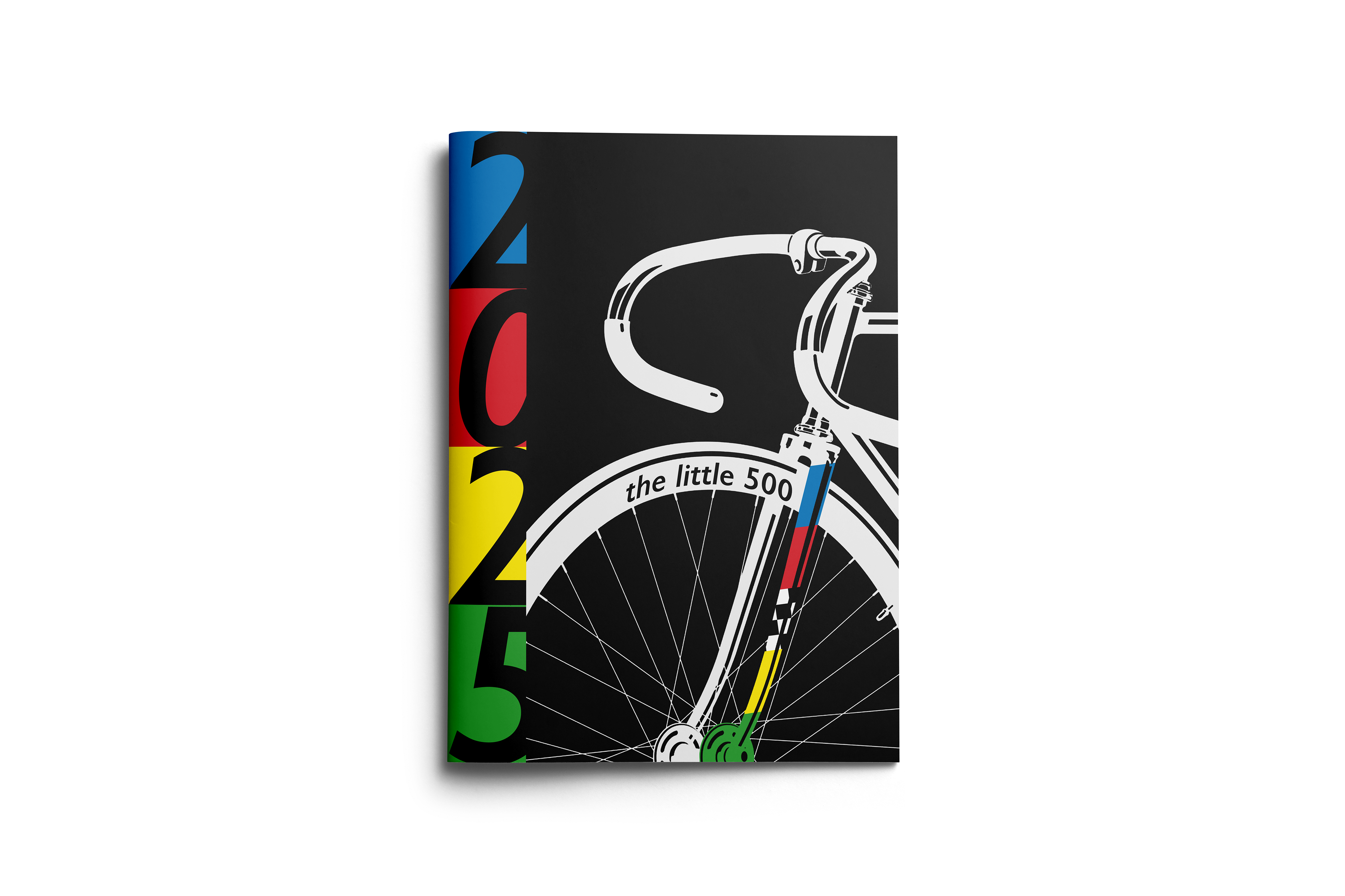
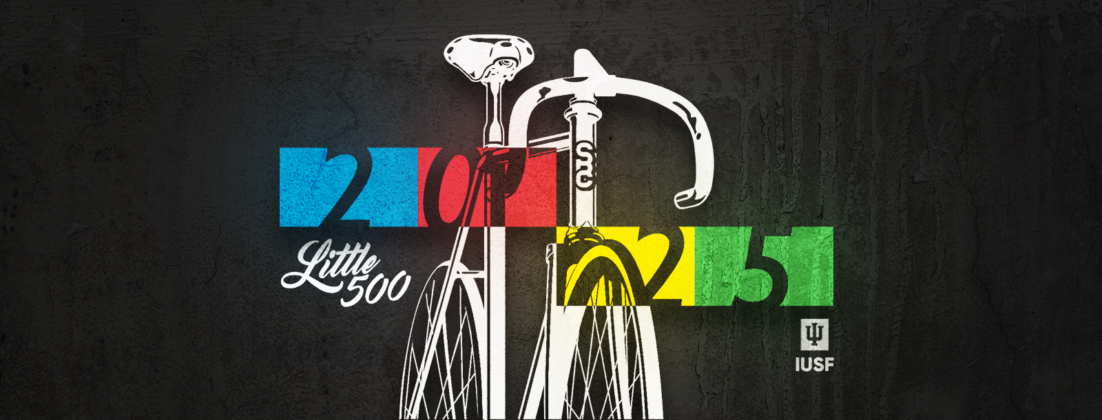
A brand built entirely from the primary colors of the race flags to give the Little 500 its own unmistakable identity.
A brand built entirely from the primary colors of the race flags to give the Little 500 its own unmistakable identity.
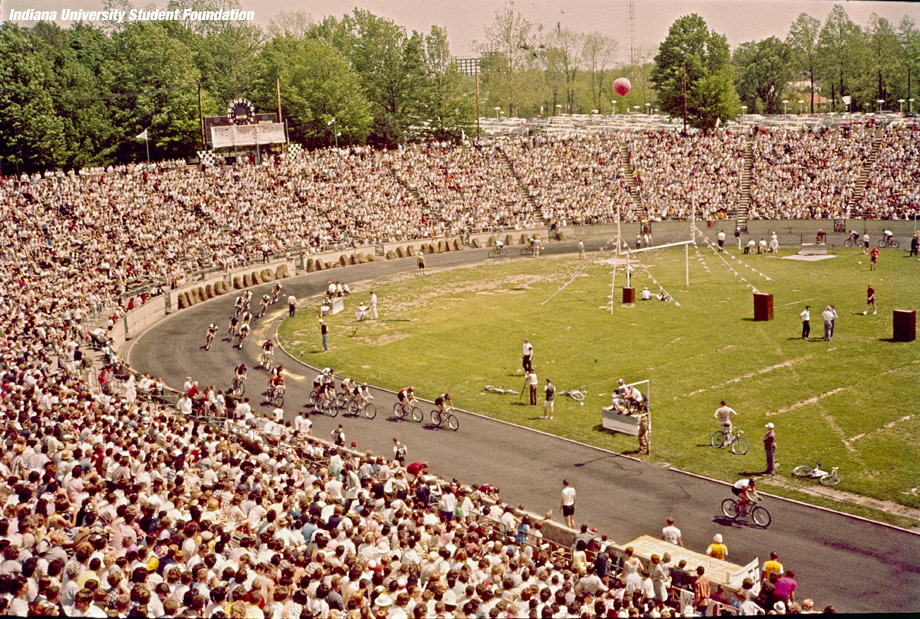
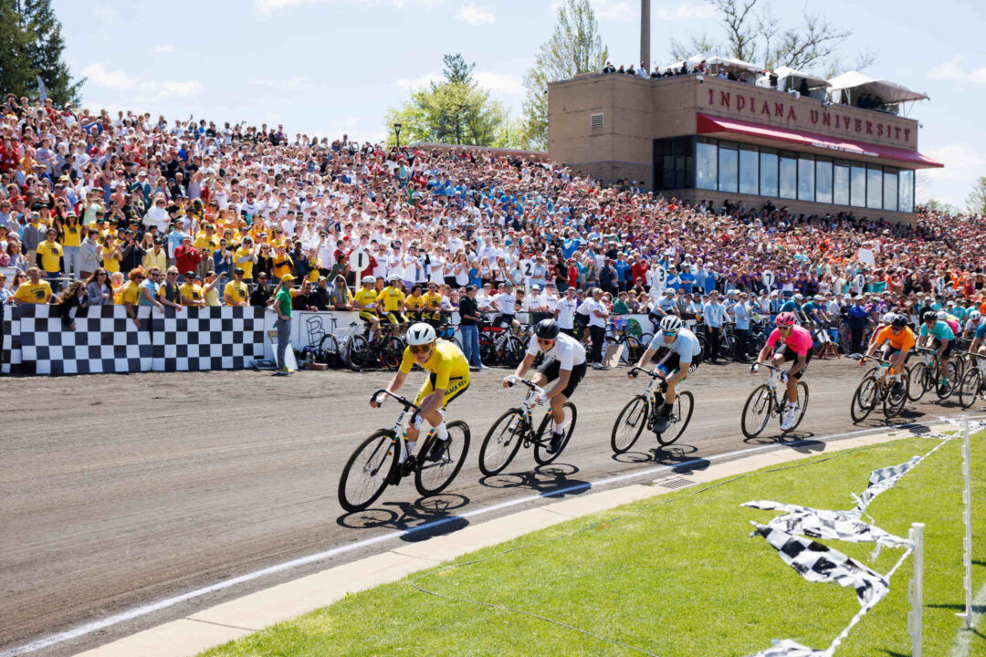
The Little 500 in 1951 and most recent 2026
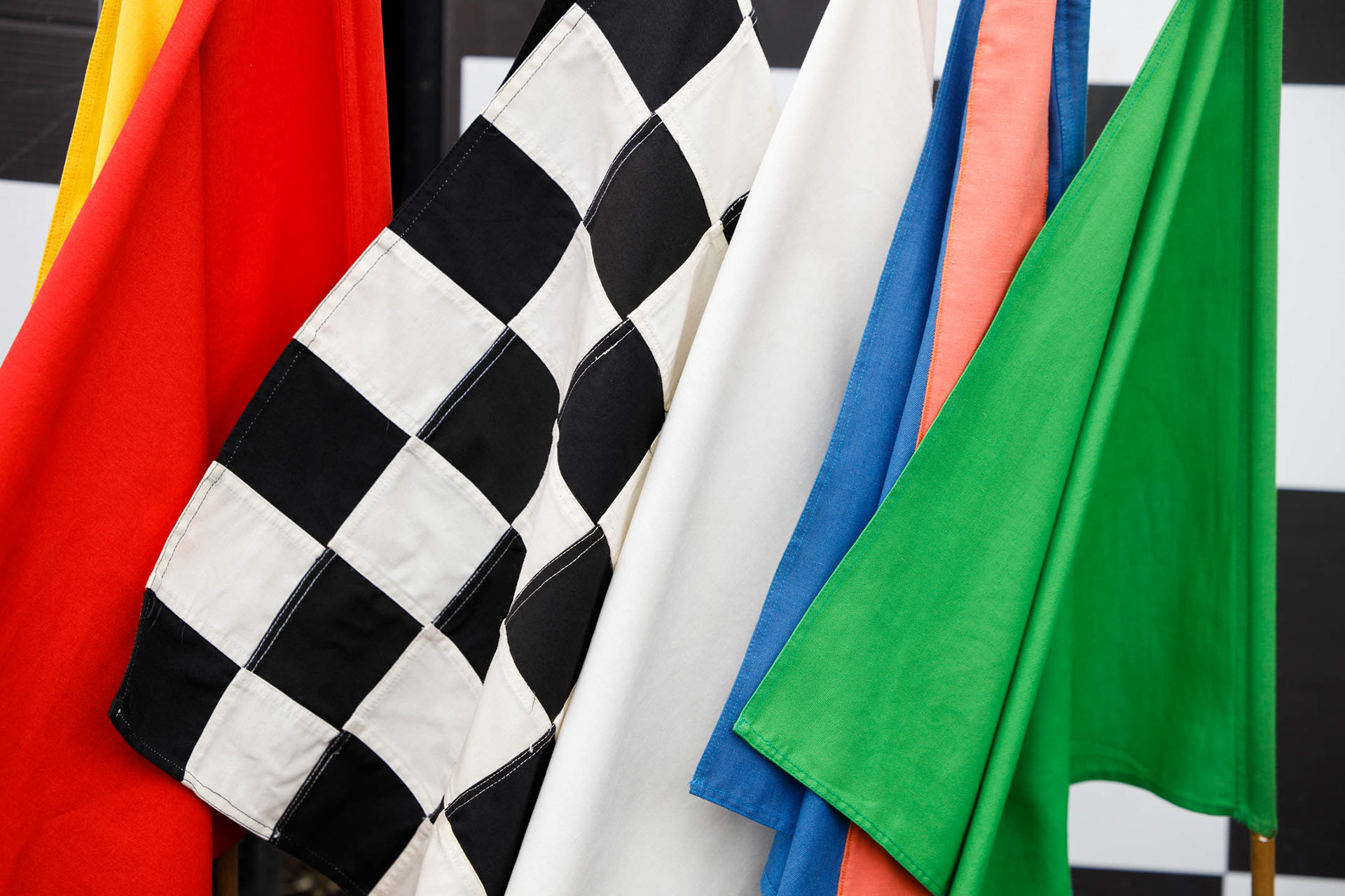
The race flags introduce the core color palette for every execution that follows.
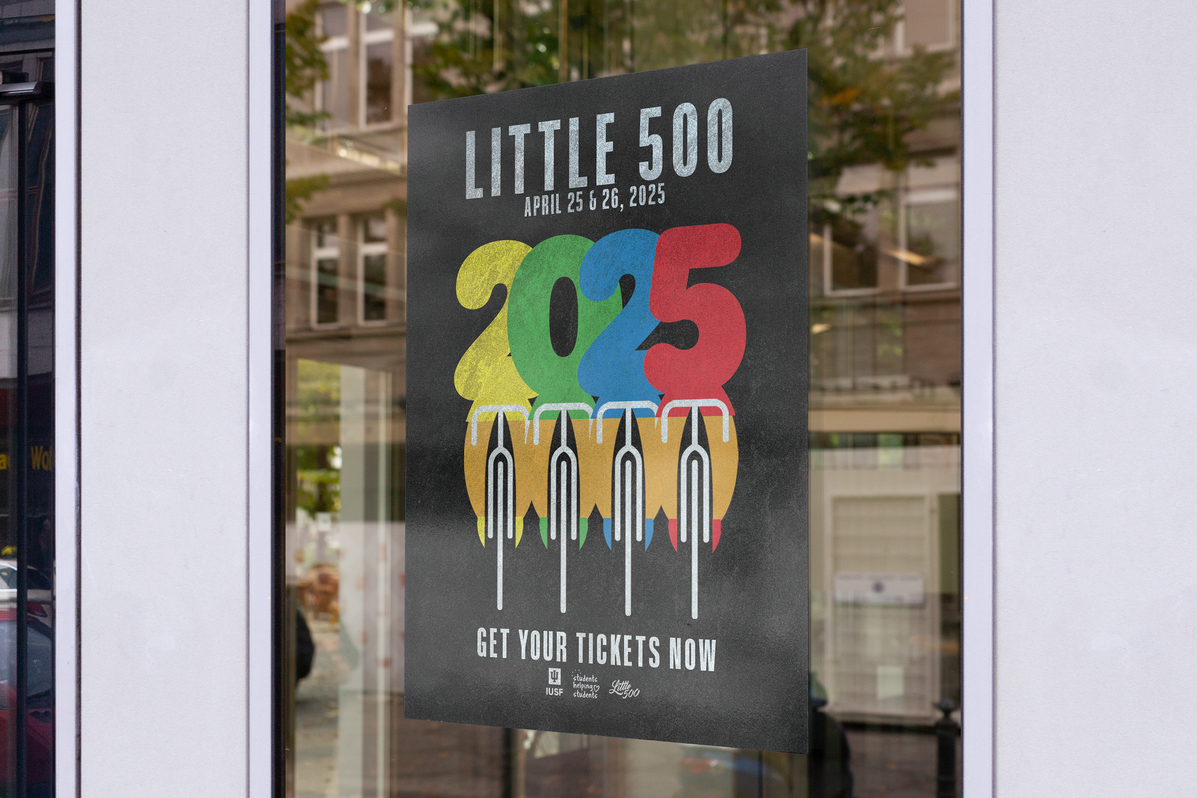
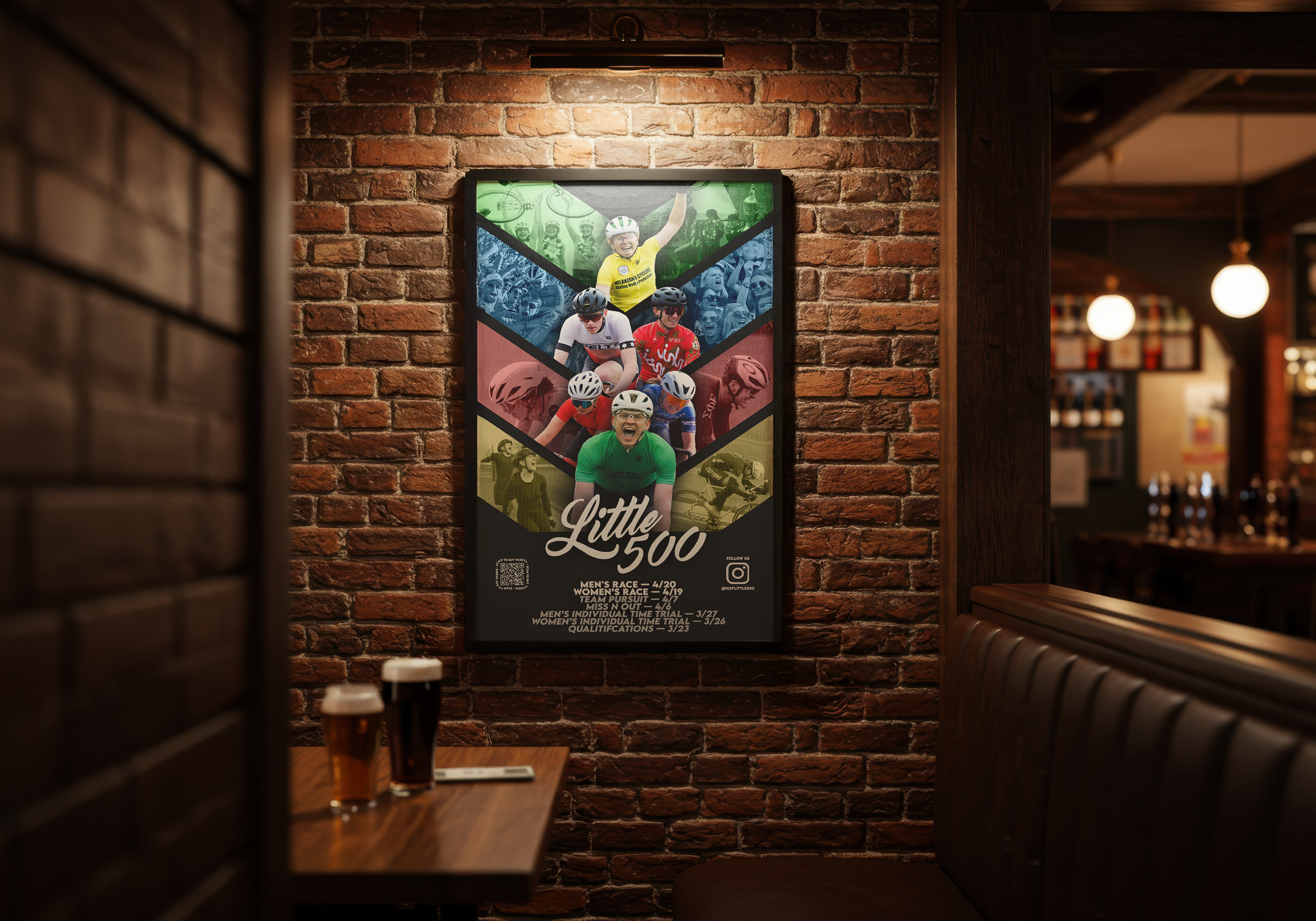
One poster captures campus-wide attention for race day, while the other activates college bars to promote the Spring Series that builds momentum toward the main event.
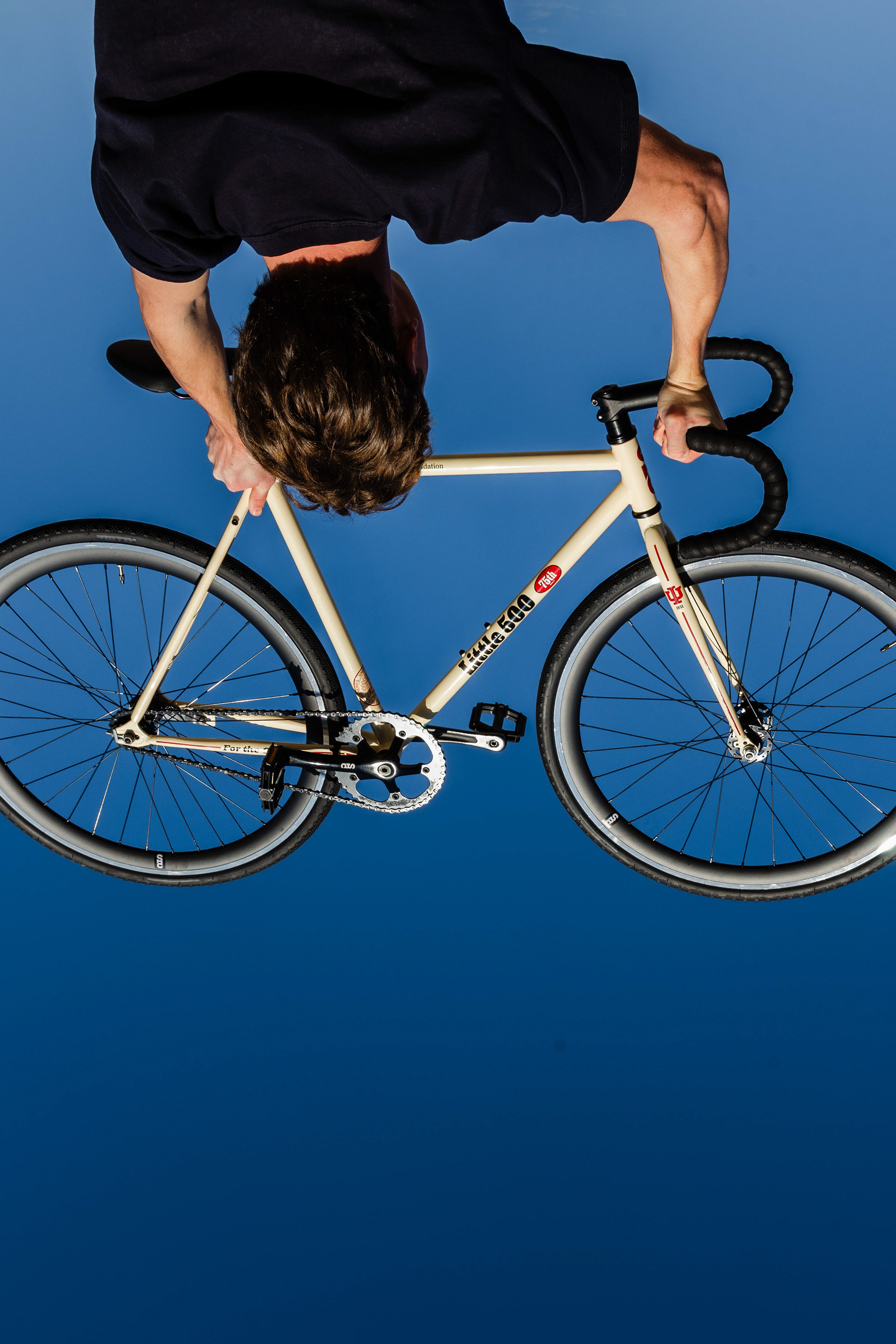
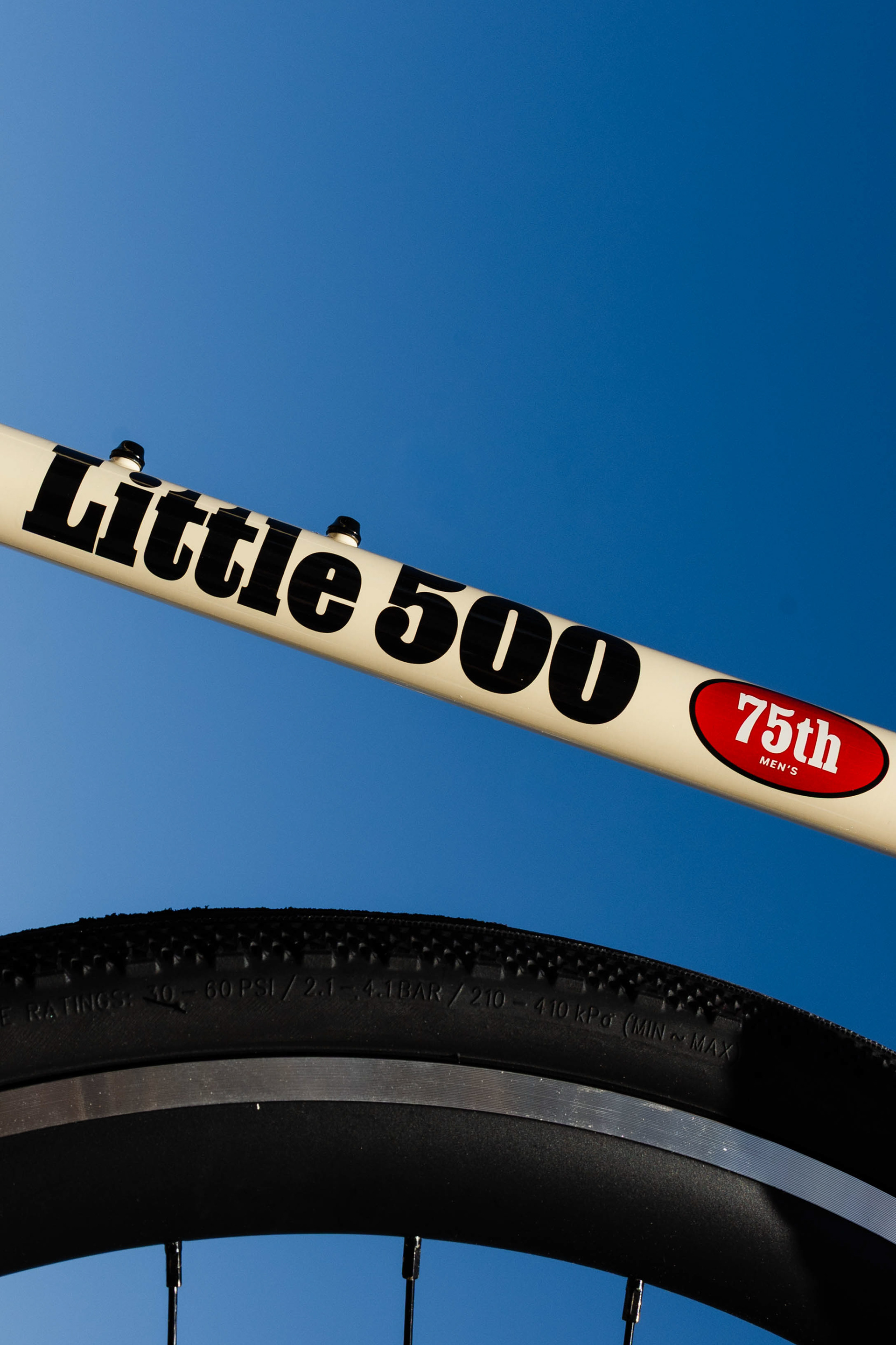
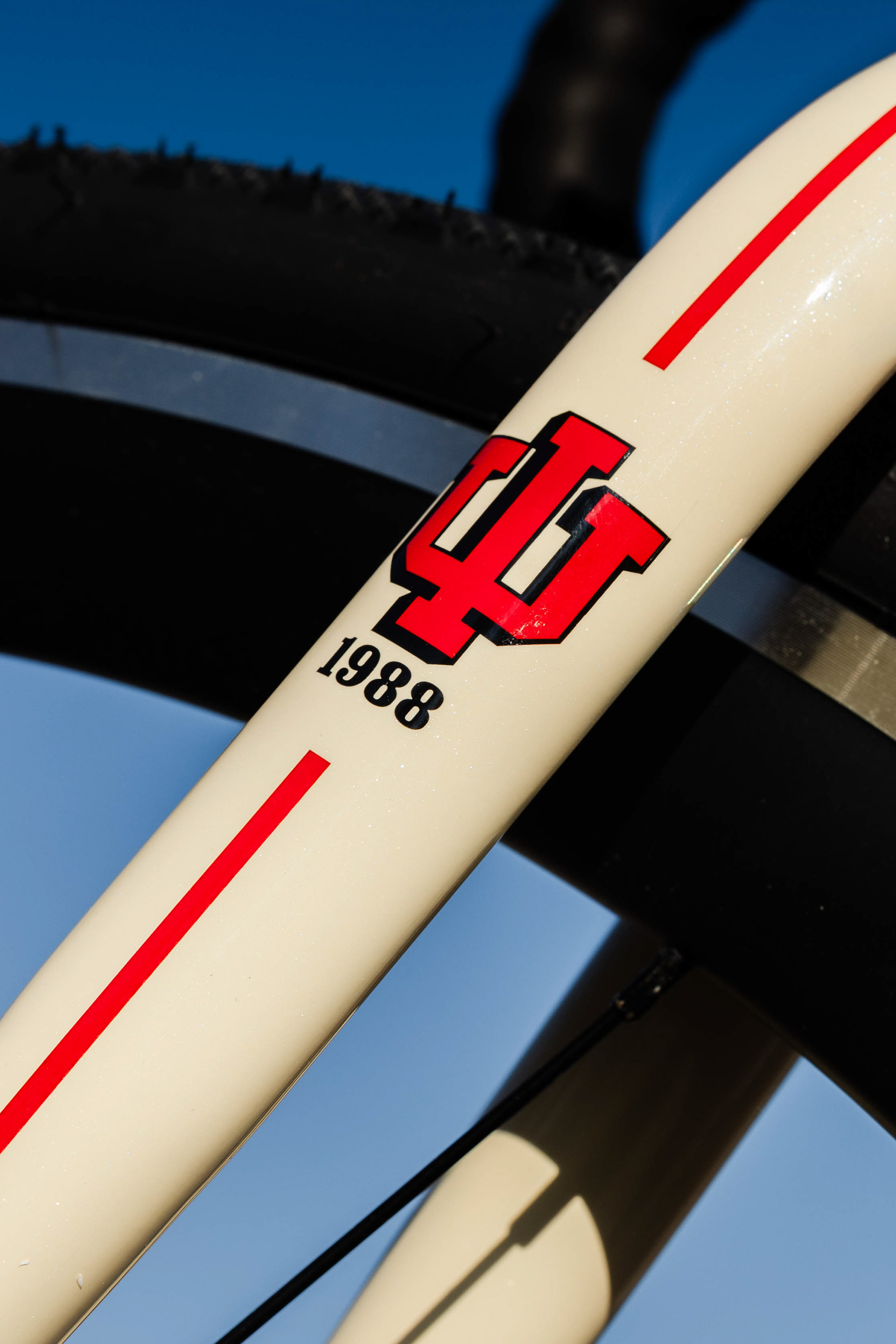
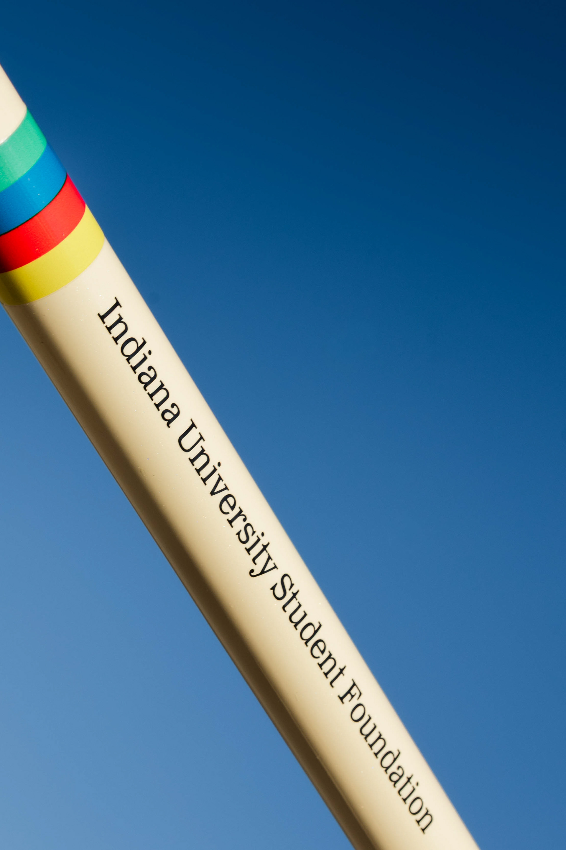
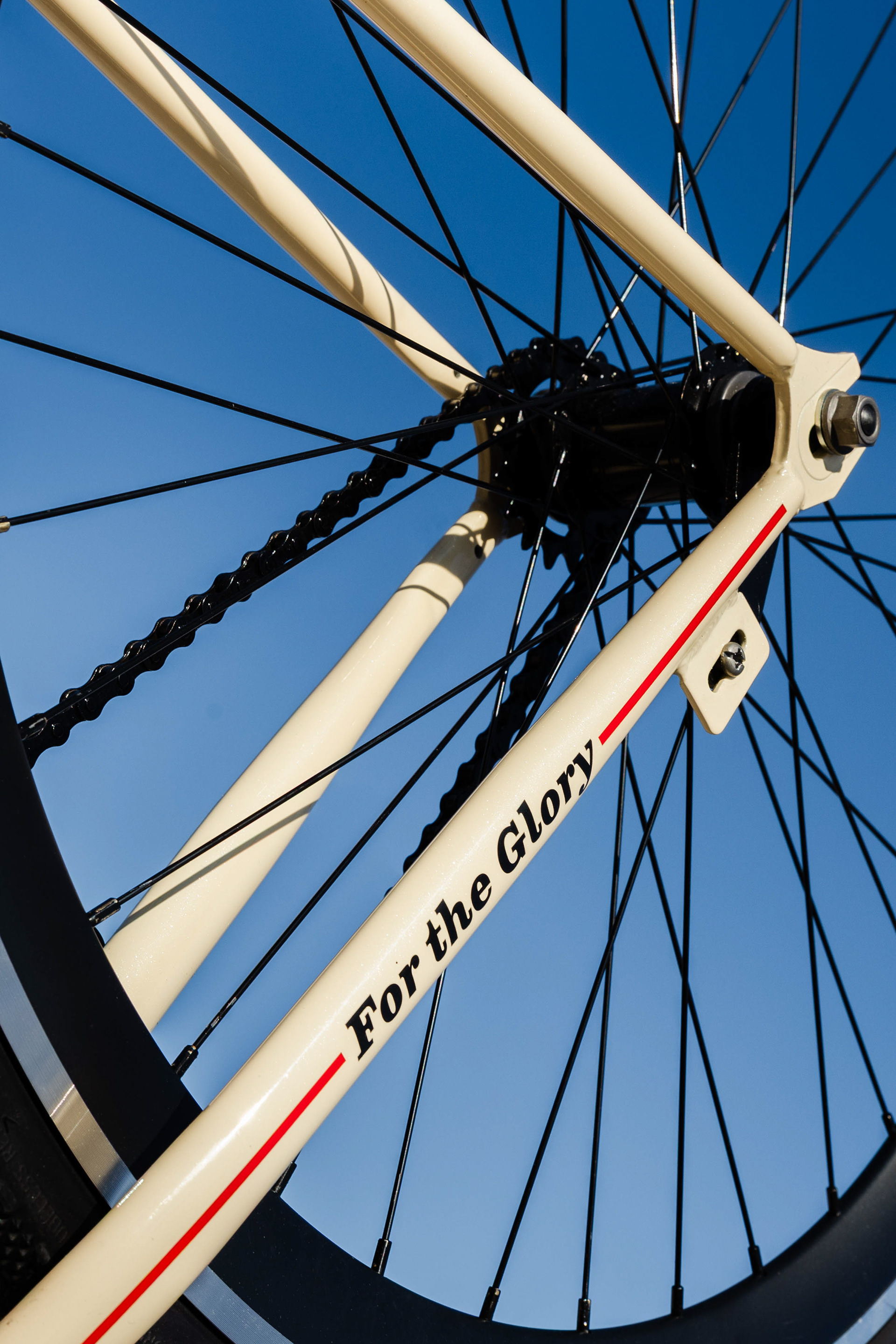
We unveiled the new branding through a 75th anniversary bike design that honored the race’s legacy.
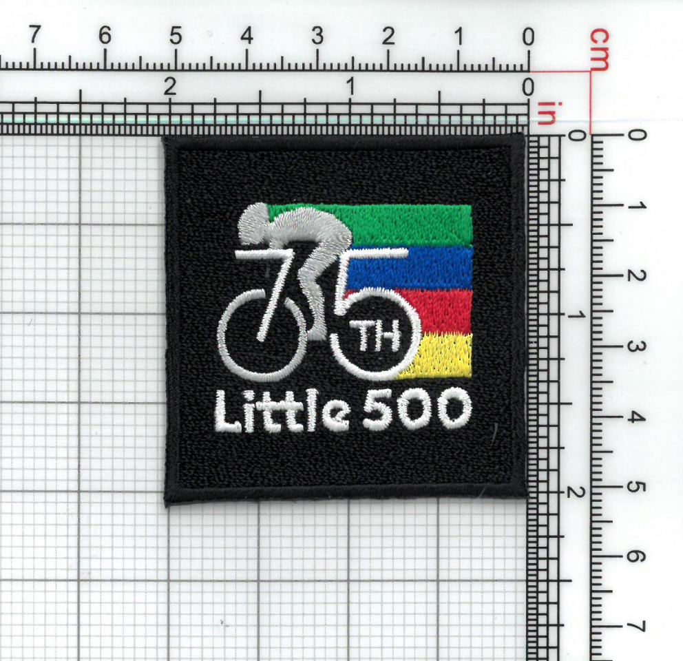
To honor 75 years of history and engage alumni and past riders, we mailed a custom 75th anniversary patch I designed alongside a commemorative race program featuring event details and race coverage.
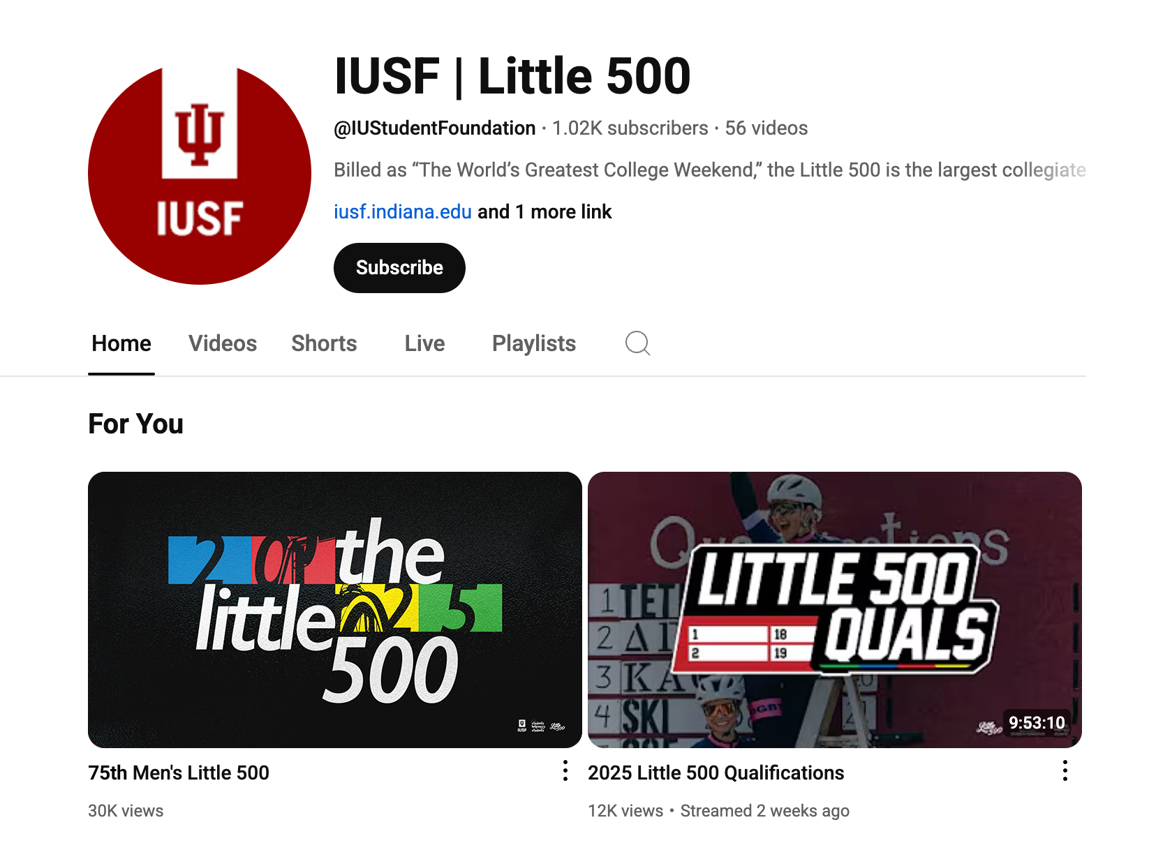
I designed the livestream graphics, including thumbnails and hold screens for the race and qualification broadcasts, and created the official Ticketmaster banner used to promote ticket sales.
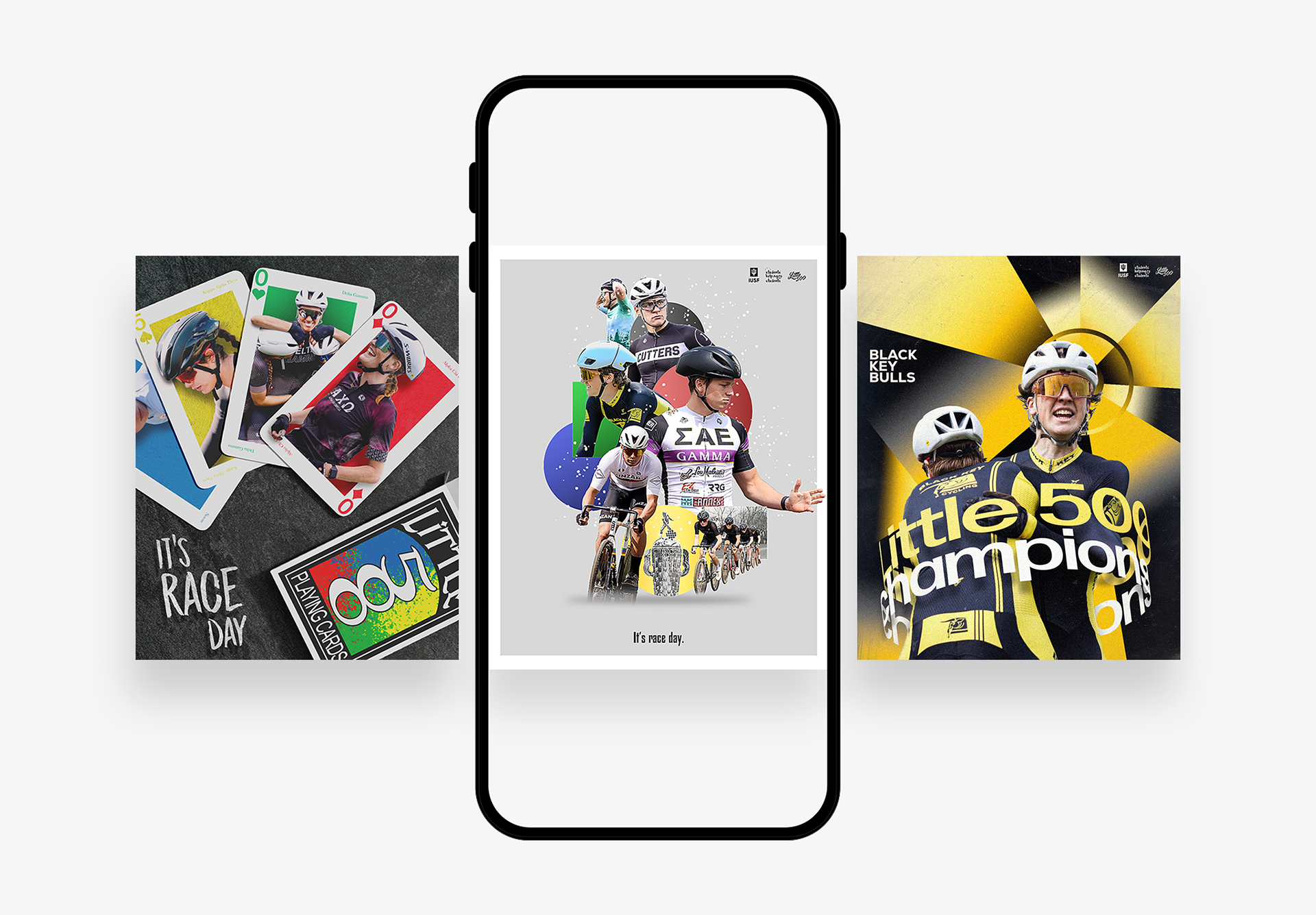
I created the social media race announcements for both the women’s and men’s events and designed the winner posts for each race.
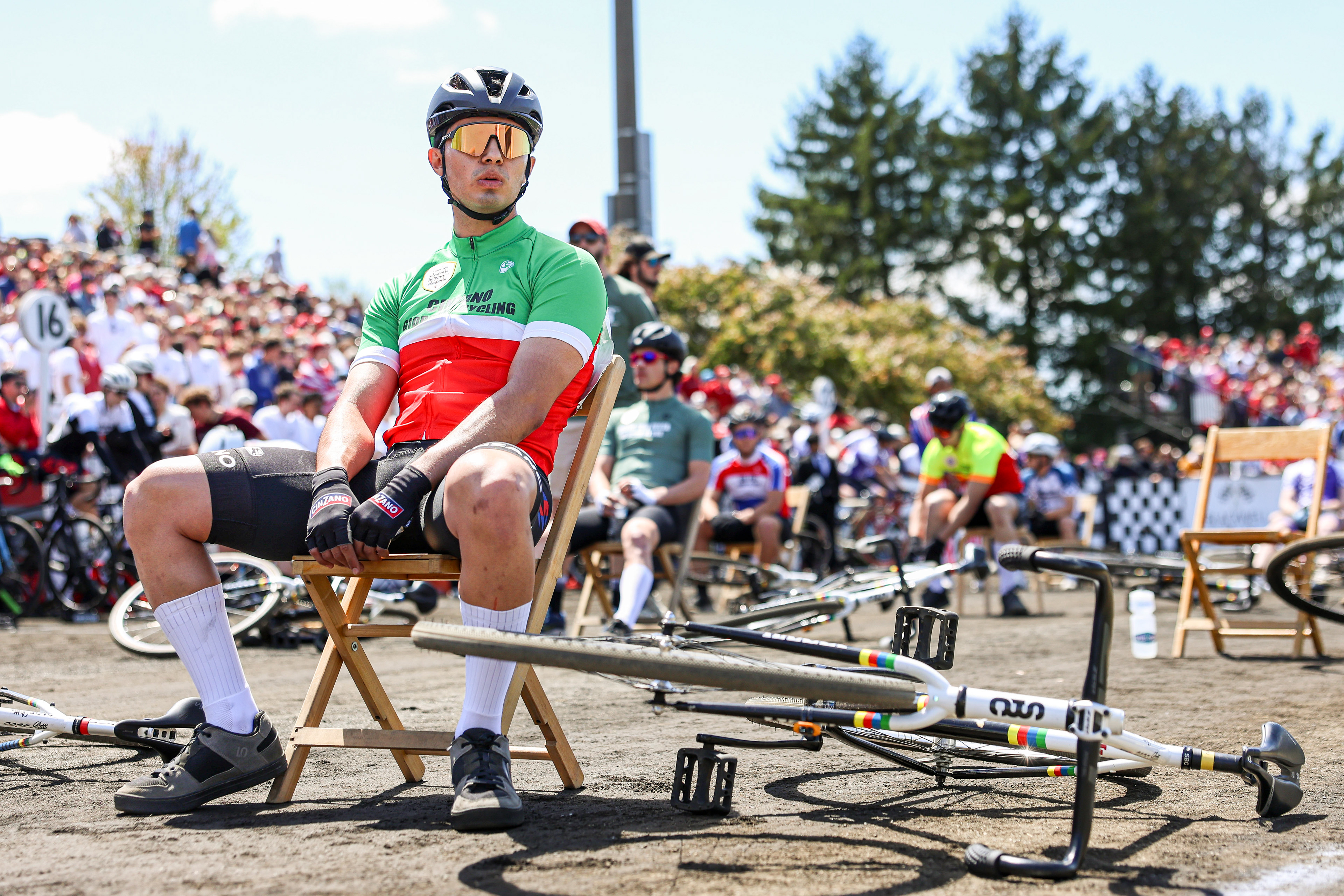
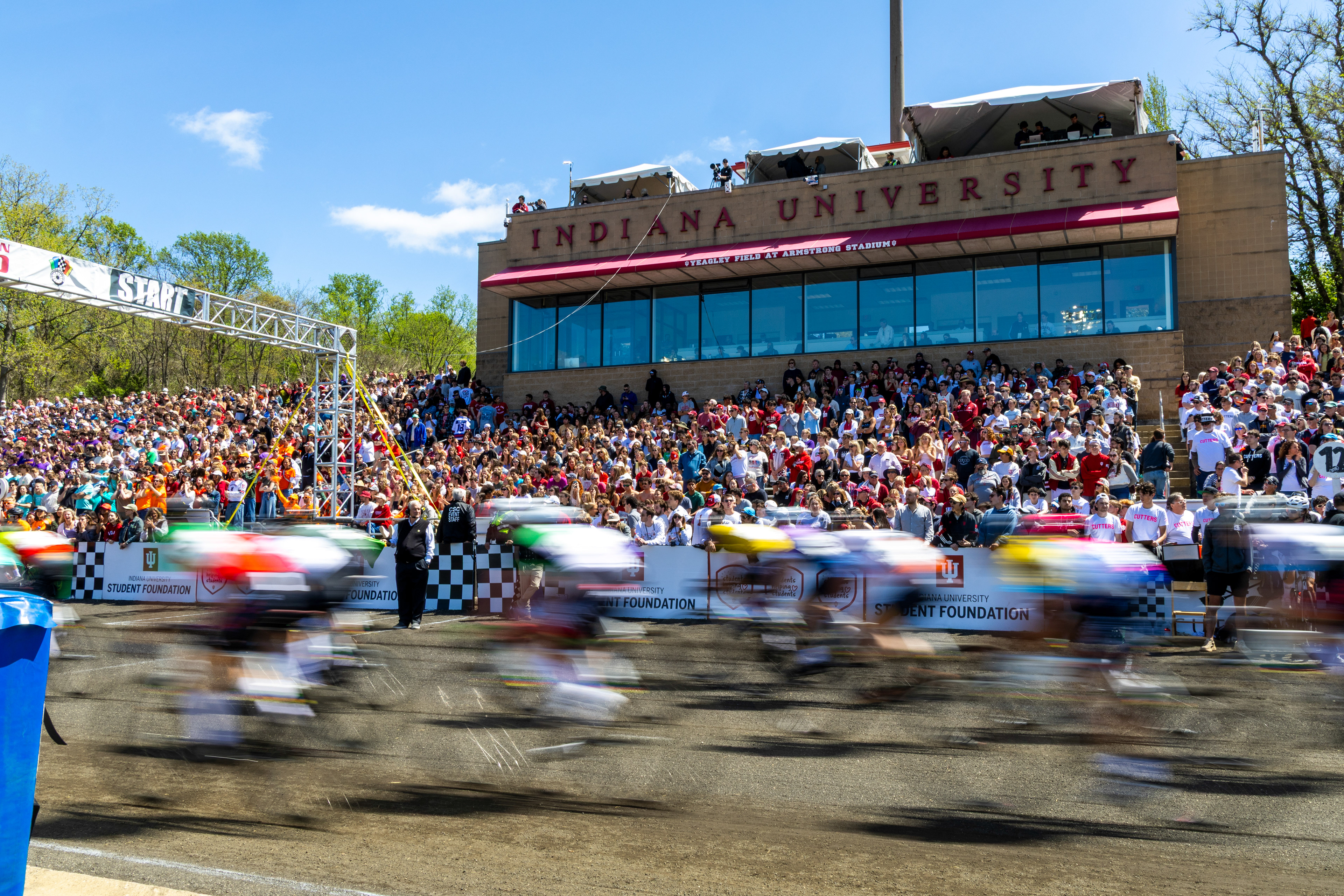
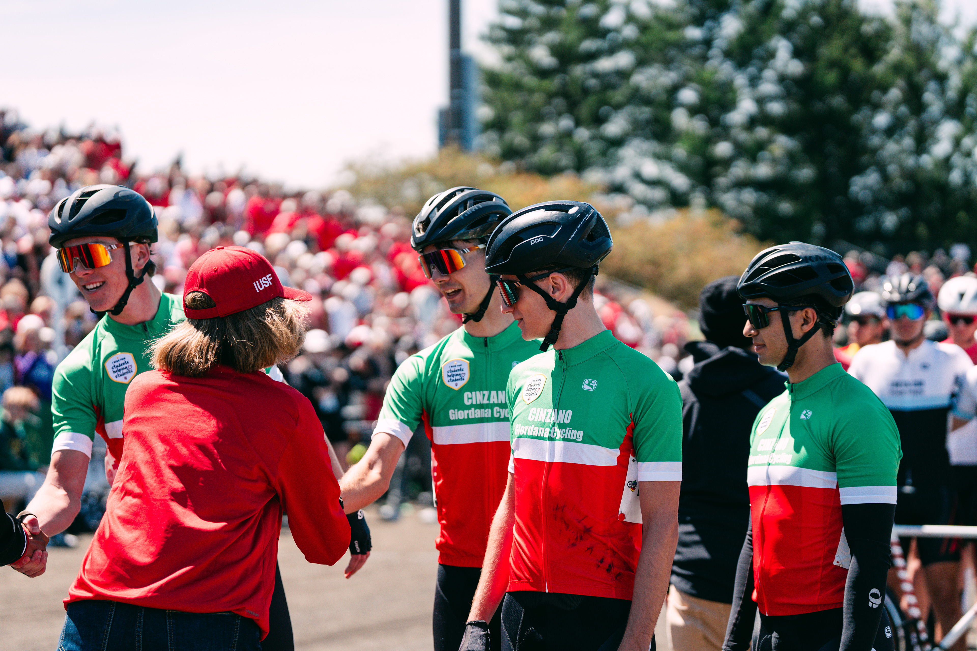
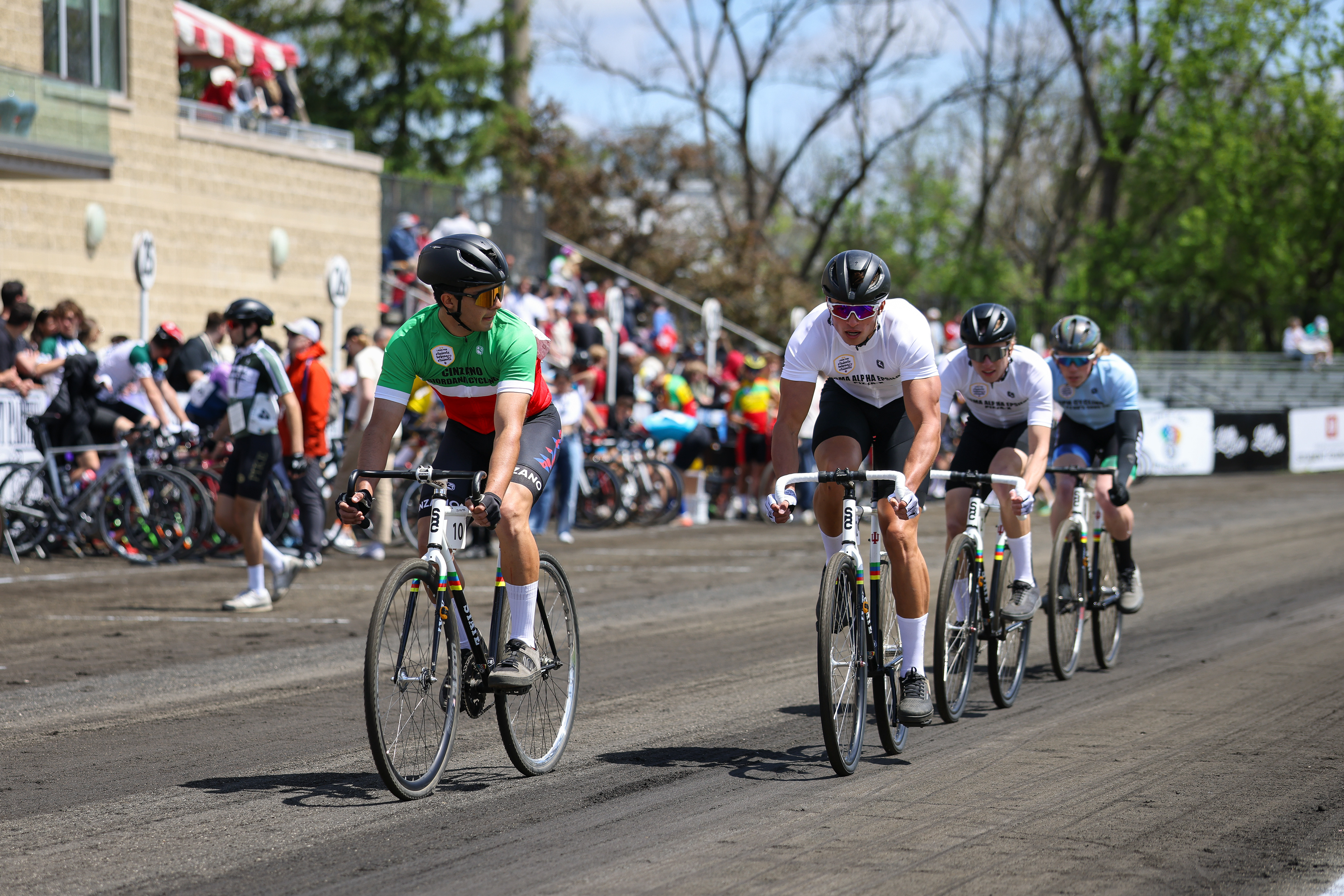
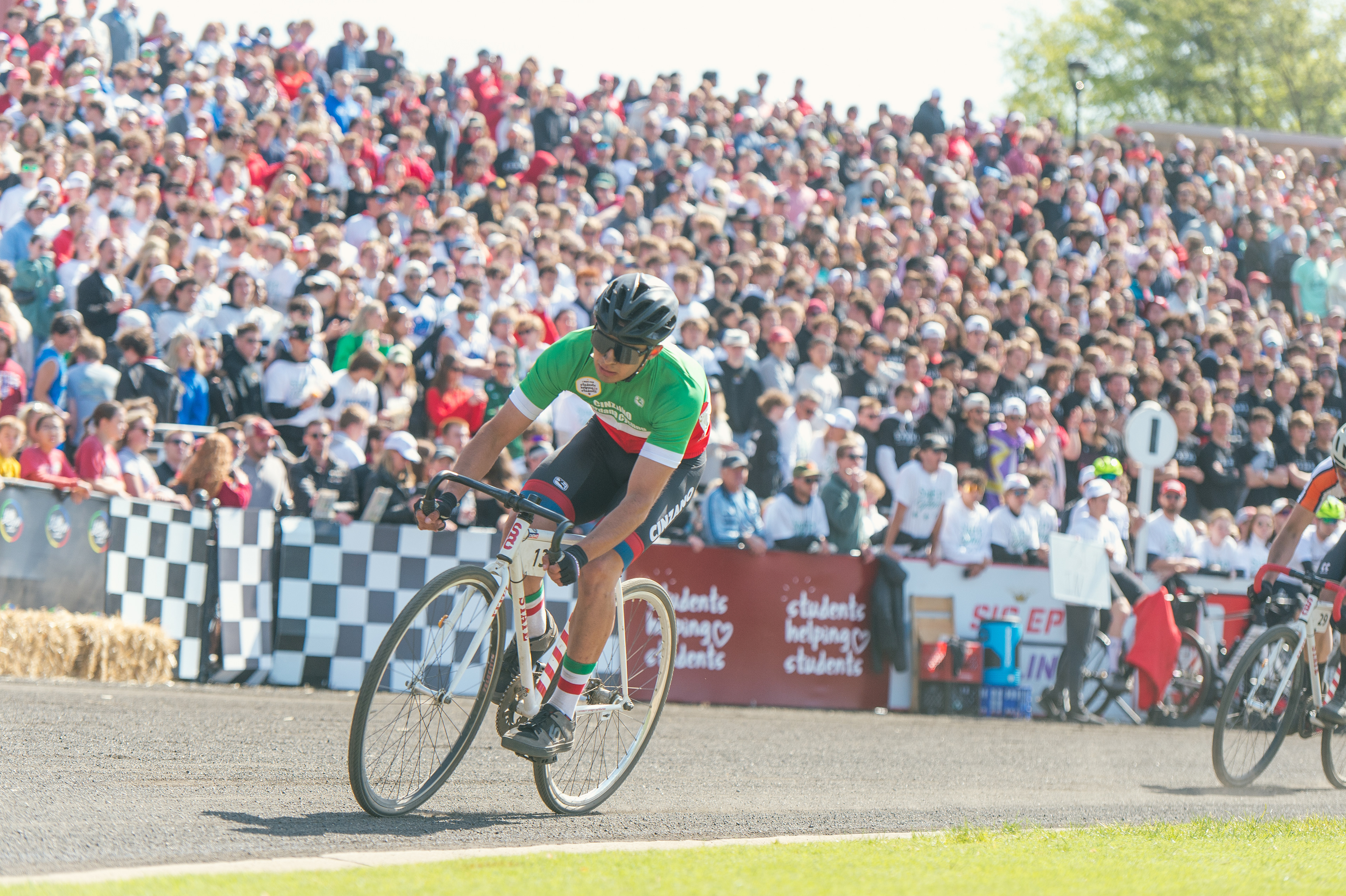
This is my most meaningful project. The Little 500 is a chaotic, very Midwest bike race at Indiana University. It has been the most influential part of my five years on campus. Through it, I found my closest friends, a real passion for exercise, and got exposed to event advertising, which is what pushed me to choose Media over Physiology.